Upload date
All time
Last hour
Today
This week
This month
This year
Type
All
Video
Channel
Playlist
Movie
Duration
Short (< 4 minutes)
Medium (4-20 minutes)
Long (> 20 minutes)
Sort by
Relevance
Rating
View count
Features
HD
Subtitles/CC
Creative Commons
3D
Live
4K
360°
VR180
HDR
28,949 results
Most people misunderstand data visualization jobs. When you hear “data visualization,” you probably think dashboards, charts, ...
78 views
3 weeks ago
I tested 30 ways to use Claude for data visualization so you don't have to. Here's what actually works. If you work in finance or ...
5,106 views
3 days ago
Claude just made 90% of data visualization tools obsolete - and it happened in a single update.** Today's AI Daily Brief dives ...
30 views
6 days ago
Grab this exact project template (Data Cleaning & Visualization): ...
9,623 views
2 weeks ago
This video shows the population ranking of European countries from 0 AD to 2026 based on historical demographic estimates and ...
235 views
This video walks through how to run a RuFaS simulation by creating biophysical input files, linking metadata and file paths, and ...
34 views
12 days ago
Power BI Charts Explained | Beginner to Advanced | Data Visualization Tutorial In this video, we explain Power BI charts in a ...
0 views
In this video I show you how to visualize your data as an analyst in 2 minutes using a Multi-LLM workflow. We are using ...
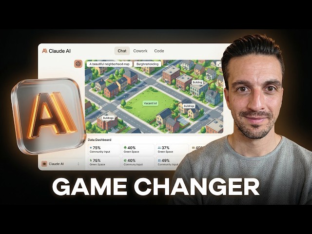
In this video, I evaluate the highly anticipated new Claude visualizer feature and demonstrate exactly how it dynamically ...
53,053 views
7 days ago
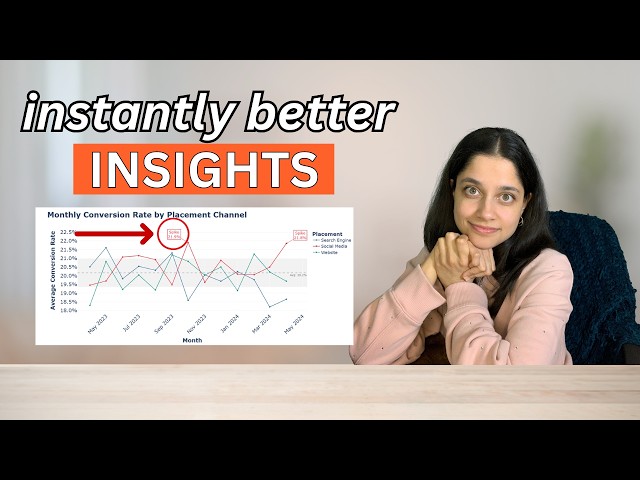
Choosing the right chart can make the difference between confusing data and clear insights. In this video, I walk through a simple ...
188 views
11 days ago
... #claude #claudeai #anthropic #aitools #diagrams #datavisualization #seo TIMESTAMP 0:00 Claude's new visualization feature ...
11,141 views
Data is everywhere — but insight is rare. On this channel, we go beyond charts and dashboards. We explore how to transform raw ...
Welcome to Royal Research! In this video, we explore Data Visualization Best Practices and how to design impactful dashboards ...
What if your data could explain itself? In this video we demonstrate how AI data visualization is changing the way people analyze ...
3 views
In Part 3 of this Data Visualization with Python Course 2026, you will create categorical, advanced statistical, and geospatial ...
99 views
1 month ago
Learn how to create advanced Pie Charts, Histograms, and Subplots in Python using Matplotlib in this step-by-step tutorial.
In this on-demand webinar James Cuthbertson, CRO at Relative Insight, explains how leading organizations combine quantitative ...
The professor going over week 9 and the last two weeks ahead over the final projects and other stuff that he is reviewing.
10 views
In Part 4 of this Data Visualization with Python Course 2026, you will learn how to customize and style charts for clarity, readability, ...
68 views


![Data Visualization with Python Course [2026] - Part 3: Categorical, Statistical & Geospatial Charts](/api/proxy/image?url=https%3A%2F%2Fi.ytimg.com%2Fvi%2FR4mnsA5dctU%2Fsddefault.jpg)


![Data Visualization with Python Course [2026] - Part 4: Chart Customization & Styling](/api/proxy/image?url=https%3A%2F%2Fi.ytimg.com%2Fvi%2FQy26YmM9KTg%2Fsddefault.jpg)