ViewTube

ViewTube
Sign inSign upSubscriptions
Filters

Upload date

Type

Duration

Sort by

Features

Reset

295 results

Christian Martinez: AI for Finance
30 Ways to use Claude for Data Visualization in FP&A and Finance

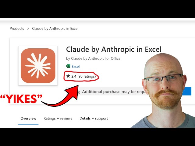
I tested 30 ways to use Claude for data visualization so you don't have to. Here's what actually works. If you work in finance or ...

12:39
30 Ways to use Claude for Data Visualization in FP&A and Finance

3,653 views

1 day ago

Alex The Analyst
Claude in Excel - Better than Copilot?

... IBM Data Analysis Specialization - https://coursera.pxf.io/AoYOdR Tableau Data Visualization - https://coursera.pxf.io/MXYqaN ...

16:55
Claude in Excel - Better than Copilot?

10,382 views

7 days ago

Excel Tricks Tips
How to Create a Professional Rating Chart in Excel | Employee Performance Dashboard | #exceltips

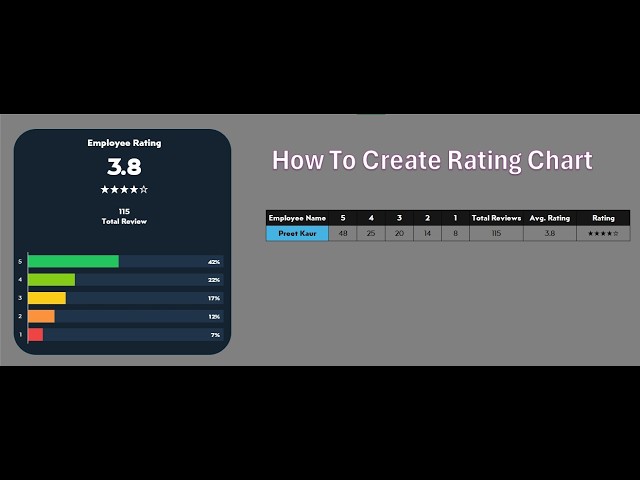
Upgrade your Excel skills by creating this modern Rating Chart. We'll transform raw data into a visual masterpiece featuring: ...

10:02
How to Create a Professional Rating Chart in Excel | Employee Performance Dashboard | #exceltips

7 views

6 days ago

Datacense
Make a Stunning Timeline Chart in Excel in Minutes

Create a Professional Timeline Chart in Excel (Step-by-Step) How to Build a Project Timeline in Excel (Easy Trick) Make a ...

19:45
Make a Stunning Timeline Chart in Excel in Minutes

589 views

2 days ago

Simon Sez IT
How to Add Sparklines in Excel - Use in Dashboards and Reports to Compare Data.

This video shows you how to add Sparklines in Excel to visualize trends directly inside cells without cluttering your worksheet.

6:13
How to Add Sparklines in Excel - Use in Dashboards and Reports to Compare Data.

588 views

1 day ago

Excel Tricks Tips
Create Exploded Rose Chart in Excel | Step-by-Step Excel Chart Tutorial || #exceltips

Learn how to create a beautiful Exploded Rose Chart in Microsoft Excel step-by-step. In this tutorial, I will show you how to turn ...

7:49
Create Exploded Rose Chart in Excel | Step-by-Step Excel Chart Tutorial || #exceltips

0 views

5 days ago

Learn Microsoft Office with Helen Bradley
Excel Map Tutorial for Beginners - Easy & Fast to Make

This beginner tutorial shows you how to use Excel's data types to make a clear data visualization, perfect for presenting ...

8:29
Excel Map Tutorial for Beginners - Easy & Fast to Make

91 views

6 days ago

Excel Tricks Tips
How to Create  Dynamic Excel Chart (Step-by-Step) || #excel  #excelchartstutorial

In this video, you'll learn how to create an amazing interactive Excel chart step by step in just 5 minutes. This dynamic chart allows ...

5:22
How to Create Dynamic Excel Chart (Step-by-Step) || #excel #excelchartstutorial

8 views

3 days ago

Learn With Javed 💻
Excel Sparklines Explained: The Skill Interviewers Notice

In this video, we will explore one of the most powerful yet hidden features in Excel 2021, known as Sparklines. As an analyst ...

8:03
Excel Sparklines Explained: The Skill Interviewers Notice

21 views

7 days ago

Piotr Garlej on Presentations
How to Add Sum Data Labels on Stacked Bar Charts and Area Chart | PowerPoint & Excel

DOWNLOAD PRESENTATION CHECKLIST: https://subscribepage.io/checklist_for_presentations ▷ ONLINE COURSE ...

5:29
How to Add Sum Data Labels on Stacked Bar Charts and Area Chart | PowerPoint & Excel

143 views

5 days ago

Teaching Junction
How to Add Data Series to a Chart in Excel (Line Graph or Line Chart)

In this video, you will learn How to Add Data Series to a Chart in Excel (Line Graph or Line Chart). You can add one, two or ...

4:17
How to Add Data Series to a Chart in Excel (Line Graph or Line Chart)

234 views

6 days ago

JMP Statistical Discovery
Level Up | Breaking Up with Excel

In this episode of Level Up, we shift from recognizing the limits of spreadsheets to actively demonstrating why a different approach ...

10:01
Level Up | Breaking Up with Excel

108 views

6 days ago

E-Learning Ethiopia 🇪🇹
Secrets to Create an Interactive Excel Dashboard in 10 Minutes | PivotTables, Charts & Slicers

In this tutorial, you'll learn how to create a fully interactive Excel dashboard in just 15 minutes using PivotTables, PivotCharts, and ...

9:00
Secrets to Create an Interactive Excel Dashboard in 10 Minutes | PivotTables, Charts & Slicers

7 views

6 days ago

SHEQXEL
🚀 Risk Assessment Dashboard – Built in Microsoft Excel

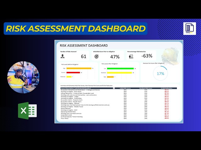
I've just completed a Risk Assessment Dashboard in Microsoft Excel designed to draw meaningful insights from a structured risk ...

8:49
🚀 Risk Assessment Dashboard – Built in Microsoft Excel

40 views

3 days ago

BillRosk
How to make a timeline chart in excel with filters that actually works

planning example. In this step-by-step Excel tutorial, you'll build a professional timeline dashboard that helps you track milestones ...

7:55
How to make a timeline chart in excel with filters that actually works

167 views

7 days ago

Mentor Edge
Excel Intermediate Tutorials 1.4 Charts & Visualizations,#spreadsheetmagic#exceltutorial #exceltips

My Passion is to help students take control of their skills and expertise, building confidence in their abilities and services.

8:25
Excel Intermediate Tutorials 1.4 Charts & Visualizations,#spreadsheetmagic#exceltutorial #exceltips

5 views

2 days ago

DataSchoolMS Code Analyze Learn 🤖💡
Excel | Pivot Table and Visualization🚀📉📈 Subscribe & Join the Fun! 📈📉#datascience #shortsfeed

DATA | Excel Pivot Table and Visualization #datascience #excel #businessanalytics #exceltips #dataanlysis #shortsfeed #shorts.

4:00
Excel | Pivot Table and Visualization🚀📉📈 Subscribe & Join the Fun! 📈📉#datascience #shortsfeed

18 views

6 days ago

VSDL Excel Pro
Dynamic Progress Chart in Excel  Step by Step Tutorial

Learn Excel step by step with VSDL Excel Pro. Learn how to create a Dynamic Progress Chart in Microsoft Excel to track progress ...

6:30
Dynamic Progress Chart in Excel Step by Step Tutorial

13 views

4 days ago

Data Analysis Mastery
How to  in Excel | Excel Tips & Tricks

Welcome to Data Analysis Mastery This video covers: Learn how to filter data in Excel to quickly reduce the size of your dataset ...

6:04
How to in Excel | Excel Tips & Tricks

0 views

6 days ago

Data Analysis Mastery
How to Find and Replace Formats in Excel | Excel Tips & Tricks

Welcome to Data Analysis Mastery This video covers: Learn how to find and replace cell formats in Excel. This video shows how ...

6:14
How to Find and Replace Formats in Excel | Excel Tips & Tricks

0 views

5 days ago

Excel with Innocent
3 Excel Charts Everyone Must Know (Bar Chart, Pie Chart & Histogram)

Learn how to create Bar Charts, Pie Charts, and Histograms in Microsoft Excel step by step. In this beginner-friendly tutorial, you'll ...

13:39
3 Excel Charts Everyone Must Know (Bar Chart, Pie Chart & Histogram)

19 views

4 days ago

Sobh's Learning
AFAP – Excel & Power BI Programme for Finance Professionals

Enrol now: https://www.sobhishanalytics.com WhatsApp for queries: +91 6282557744 Are you a finance professional in FP&A, ...

14:43
AFAP – Excel & Power BI Programme for Finance Professionals

185 views

5 days ago

Statistics Basics
Learn How to Create X-bar and S (Standard Deviation) Charts in Excel

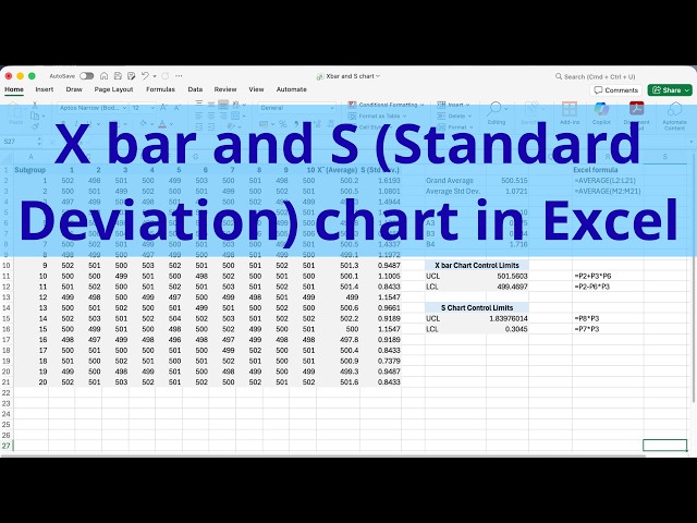
This video guides you through the exact process of determining control limits for X bar and S (Standard Deviation) charts.

4:43
Learn How to Create X-bar and S (Standard Deviation) Charts in Excel

11 views

23 hours ago

Mr.Wonderful-AS
Excel Trick Every Manager Should Know! 💡Build a dynamic dashboard to monitor sales instantly.

#Mr.wonderful @Mr.Wonderful-As #ExcelDashboard #ExcelTips #ExcelTricks #SalesDashboard #DataVisualization ...

18:08
Excel Trick Every Manager Should Know! 💡Build a dynamic dashboard to monitor sales instantly.

12 views

4 days ago

Ben Academy
How to Create a Column Chart in Excel | Step-by-Step Tutorial for Beginners

Column charts are one of the most common and powerful ways to visualize data in Excel. In this tutorial, you will learn how to ...

11:28
How to Create a Column Chart in Excel | Step-by-Step Tutorial for Beginners

54 views

6 days ago