Upload date
All time
Last hour
Today
This week
This month
This year
Type
All
Video
Channel
Playlist
Movie
Duration
Short (< 4 minutes)
Medium (4-20 minutes)
Long (> 20 minutes)
Sort by
Relevance
Rating
View count
Features
HD
Subtitles/CC
Creative Commons
3D
Live
4K
360°
VR180
HDR
46,286 results
Take my Full Excel for Data Analytics Course! https://www.analystbuilder.com/courses/excel-for-data-analytics In this video we ...
1,205,523 views
3 years ago
Take my Full Excel for Data Analytics Course! https://www.analystbuilder.com/courses/excel-for-data-analytics Excel is one of the ...
805,420 views
4 years ago
Chart Template for Plan vs Actual Comparisons: Showcase Simple IBCS-Style Chart Template ...
2,217 views
1 year ago
Take my Full Excel Course Here: https://www.analystbuilder.com/courses/excel-for-data-analytics Download Datasets: ...
144,638 views
Did you know you can use the pandas Python library inside Microsoft Excel to conduct advanced statistical modeling? Watch here ...
48,307 views
2 years ago
1,238,580 views
Excel Waterfall Chart: Beginner's Guide Learn how to create a waterfall chart in Excel with this beginner's guide! Waterfall charts ...
52,564 views
616,622 views
Want to make your Excel spreadsheets more dynamic? Learn how to create Progress Bars to track goals, deadlines, or tasks ...
451 views
Support Me & More: linktr.ee/benthompsonuk In this video, we will show you why it's time to say goodbye to filters and embrace ...
2,423 views
In Excel Excel Column Cells add Charts | Data Visualization - Data with Chart in Excel #shorts Learning #Charts #ColumnChart ...
33 views
... excel so to do that let's jump on over to our main page here and first thing you're going to want to do is just open up the data file ...
284 views
5 years ago
In this Microsoft Excel tutorial, you'll learn how to make great data visualizations in Excel. Learn and master the art of creating a ...
401 views
Simple techniques - using Excel and other tools - can help you to visualize data and present information clearly and effectively.
42 views
9 years ago
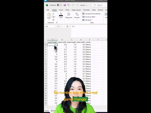
You can now visualize your data using Python in Excel! + = Watch here as Anaconda's Sophia Yang walks through three ...
24,061 views
My Courses on Linkedin Learning: https://www.linkedin.com/learning/instructors/tim-ngwena My Courses on Linkedin Learning: ...
10,293 views
Check out all my Full Courses on Analyst Builder: https://www.analystbuilder.com/ 25% Off Analyst Builder Code: BOOTCAMP In ...
1,058,536 views
In the realm of Excel's powerful features lies a tool that transforms raw data into insightful visual representations - Charts. When it ...
58 views
Check out my Full Tableau Course Here: https://www.analystbuilder.com/courses/tableau-for-data-visualization This is our first of ...
985,624 views
Learn how to create a powerful Target Chart in Excel in just 60 seconds! Perfect for tracking goals, performance, and progress ...
63 views


![Ultimate Data Analyst Bootcamp [24 Hours!] for FREE | SQL, Excel, Tableau, Power BI, Python, Azure](/api/proxy/image?url=https%3A%2F%2Fi.ytimg.com%2Fvi%2FwQQR60KtnFY%2Fsddefault.jpg)


