ViewTube

ViewTube
Sign inSign upSubscriptions
Filters

Upload date

Type

Duration

Sort by

Features

Reset

1,507 results

Dr Mehrdad Arashpour
Project Delay Analysis ✨ EXCEL Pareto Front Optimization 💡 Railway Infrastructure Project Management

I use RODE: https://amzn.to/4nHhzmN Animate Project Delay Analysis in Excel! This video, explained by Dr. Mehrdad Arashpour, ...

13:00
Project Delay Analysis ✨ EXCEL Pareto Front Optimization 💡 Railway Infrastructure Project Management

1,315 views

1 year ago

Dr Mehrdad Arashpour
EXCEL Project 2026 → Pivot Table & Chart 🔔 Project Stakeholder Management & Communication

I use Insta360: https://amzn.to/4mvNoxZ In this video of #engineeringmanagementacademy #pivottable is tutored in an ...

2:47
EXCEL Project 2026 → Pivot Table & Chart 🔔 Project Stakeholder Management & Communication

423 views

1 year ago

How to Learn Excel
How to Create a Waterfall Chart in Excel

How to Create a Waterfall Chart in Excel (in Excel 2016 or newer) | How to Learn Excel In this video, we'll walk through creating a ...

2:45
How to Create a Waterfall Chart in Excel

1,729 views

1 year ago

Dr Mehrdad Arashpour
EXCEL Sparklines for Big Data Trends (2026) 📊 Project Communications Management via Mini Charts

I use Insta360: https://amzn.to/4mvNoxZ In this video of #engineeringmanagementacademy #sparklines are tutored for ...

2:57
EXCEL Sparklines for Big Data Trends (2026) 📊 Project Communications Management via Mini Charts

195 views

1 year ago

How to Learn Excel
Compare Consecutive Rows Like a Pro! – Power Query Challenge 02

Compare Consecutive Rows Like a Pro! – Power Query Challenge 02 Hello and welcome! In this video, we tackle a Power Query ...

2:48
Compare Consecutive Rows Like a Pro! – Power Query Challenge 02

638 views

1 year ago

Stimulsoft
Interactive Dashboard: Export Dashboard to Excel (Only Items) [Shot on v2018]

This video demonstrates how to: 1 Show Dashboard; 2 Export to Excel. https://stimulsoft.com.

0:50
Interactive Dashboard: Export Dashboard to Excel (Only Items) [Shot on v2018]

744 views

7 years ago

Cory Budischak
Excel Tip 12   Working with Big Data Part One   Visualization and Manipulation

This video covers basics of working with big data in excel including: Split Panes, GoTo, shift vs. control for selecting cells, and ...

6:53
Excel Tip 12 Working with Big Data Part One Visualization and Manipulation

3,127 views

11 years ago

Visualizing the Future
What is Data Visualization? | Data Visualization 101

Presented by David Christensen. This video is part of a series of lectures recorded to teach about basic data visualization ...

6:13
What is Data Visualization? | Data Visualization 101

316 views

4 years ago

Duke Center for Data & Visualization Sciences
Make a Forest Plot in Excel

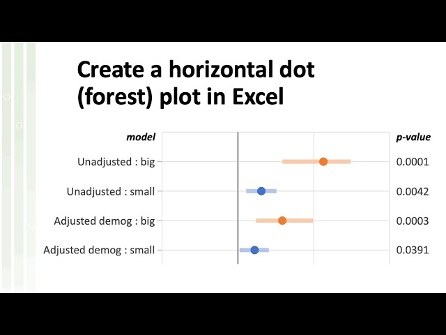
Horizontal bar charts are one of the Excel default plots, but what if you need the same arragement, but with symbols instead of ...

55:13
Make a Forest Plot in Excel

9,280 views

2 years ago

Smart Minds Map
How I built a ONE CLICK Excel Dashboard using ChatGPT  (100% Free) 😎

exceldashboardstutorial #excelskills #excelforbeginners Prompt 1 This is the structure of my sales data in JSON format.

4:10
How I built a ONE CLICK Excel Dashboard using ChatGPT (100% Free) 😎

491 views

1 year ago

Nodus Labs
How to Visualize CSV Spreadsheet Data as a Knowledge Graph and Use AI to Understand its Content

Using https://infranodus.com you can visualize the content of any CSV spreadsheet as a knowledge graph, so you can see the ...

9:51
How to Visualize CSV Spreadsheet Data as a Knowledge Graph and Use AI to Understand its Content

2,524 views

1 year ago

Just Tim
Sigma Computing Explained to a Tableau User | A conversation with Katrina Menne

My Courses on Linkedin Learning: https://www.linkedin.com/learning/instructors/tim-ngwena Boost your skills with DataCamp's ...

1:45:56
Sigma Computing Explained to a Tableau User | A conversation with Katrina Menne

7,685 views

1 year ago

How to Learn Excel
Unpivot Data in Excel - Power Query Basics Tutorial

Unpivot Data in Excel - Power Query Basics Tutorial Are you struggling to organize your data in Excel? In this tutorial, we will ...

2:22
Unpivot Data in Excel - Power Query Basics Tutorial

1,052 views

1 year ago

Discover Talent™
insert chart switch row and column in excel | Data Visualization quick tip Discover Talent Presents

Raw dump is creating in better visualization which helps for better good business decision here is quick tip insert chart switch row ...

0:47
insert chart switch row and column in excel | Data Visualization quick tip Discover Talent Presents

40 views

4 years ago

Yuvraj Dagur
Introducing Clevrr Sheets | AI Data Visualisation & Data Analysis Agent | Spreadsheet Dashboard AI

Analyse and visualise your data in spreadsheets using natural language english with Clevrr Sheets. Create beautiful dashboards ...

4:39
Introducing Clevrr Sheets | AI Data Visualisation & Data Analysis Agent | Spreadsheet Dashboard AI

113 views

1 year ago

How to Learn Excel
Funnel Chart Mastery: Excel Tutorial for Clear Visuals

Funnel Chart Mastery: Step-by-Step Excel Guide | HowToLearnExcel Want to visualize data flow in a clear and structured way?

2:46
Funnel Chart Mastery: Excel Tutorial for Clear Visuals

200 views

1 year ago

Dr Mehrdad Arashpour
Linear Regression in Excel 2026: 4 Easy Steps - Project Management & Quality Assurance

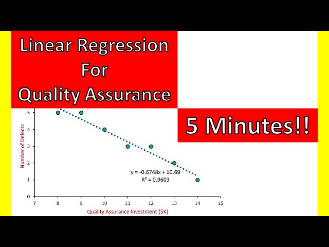
I use iPhone 17 pro max→ https://amzn.to/3Vr1BB6 In this video of #engineeringmanagementacademy #LinearRegression is ...

5:14
Linear Regression in Excel 2026: 4 Easy Steps - Project Management & Quality Assurance

605 views

1 year ago

Marco Serafini
Data Visualization in Obsidian with Obsidian Charts

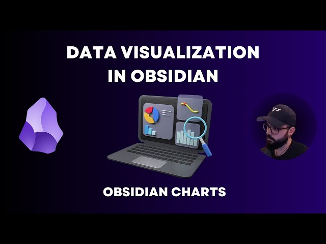
Hello everyone! In todays video I want to show you how you can use Obsidian for data visualization by using Obsidian Charts, ...

13:40
Data Visualization in Obsidian with Obsidian Charts

25,867 views

2 years ago

How to Learn Excel
Excel Charts 101: Best Practices for Clean and Effective Charts

Excel Charts 101: Best Practices for Clean and Effective Charts In this tutorial, you will learn: How to properly organize your data ...

2:24
Excel Charts 101: Best Practices for Clean and Effective Charts

309 views

1 year ago

Statwolf
Create your Dashboard in 4 Steps | Statwolf, Powerful end-to-end data analytics, designed for you.

Manage every step of the data journey, from data integration to visualization and machine learning. Let's have a look at simple ...

3:10
Create your Dashboard in 4 Steps | Statwolf, Powerful end-to-end data analytics, designed for you.

1,599 views

5 years ago