Upload date
All time
Last hour
Today
This week
This month
This year
Type
All
Video
Channel
Playlist
Movie
Duration
Short (< 4 minutes)
Medium (4-20 minutes)
Long (> 20 minutes)
Sort by
Relevance
Rating
View count
Features
HD
Subtitles/CC
Creative Commons
3D
Live
4K
360°
VR180
HDR
702 results
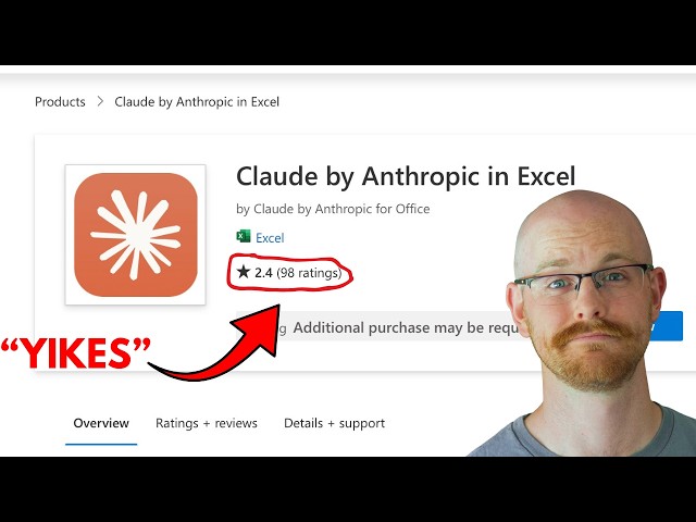
I tested 30 ways to use Claude for data visualization so you don't have to. Here's what actually works. If you work in finance or ...
3,023 views
1 day ago
... IBM Data Analysis Specialization - https://coursera.pxf.io/AoYOdR Tableau Data Visualization - https://coursera.pxf.io/MXYqaN ...
10,000 views
6 days ago
In this video, learn how to create a fully interactive Excel dashboard in just 10 minutes using Copilot AI. Data Set (Materials): ...
986 views
16 hours ago
In this video, I build an HR Attrition Dashboard in Excel, analyzing who is leaving the company, why they are leaving, and which ...
0 views
7 days ago
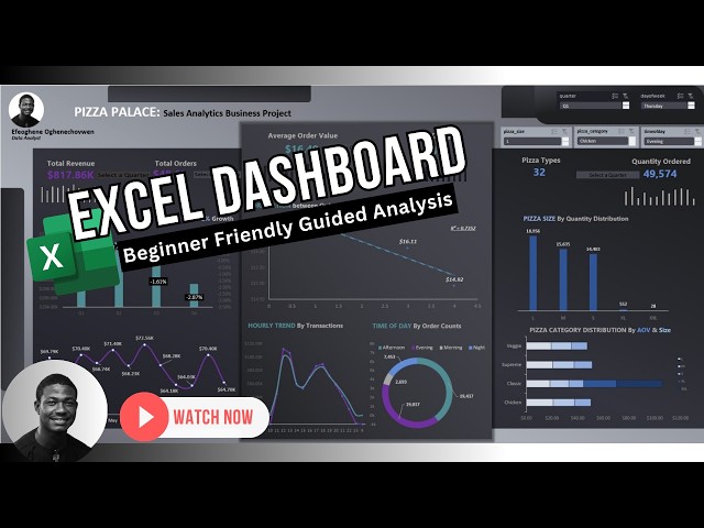
Learn how to build a complete Excel Sales Dashboard from scratch in 2026. Perfect for beginners with no prior Excel experience.
64 views
Learn how to create a beautiful Exploded Rose Chart in Microsoft Excel step-by-step. In this tutorial, I will show you how to turn ...
4 days ago
Create a Professional Timeline Chart in Excel (Step-by-Step) How to Build a Project Timeline in Excel (Easy Trick) Make a ...
531 views
This beginner tutorial shows you how to use Excel's data types to make a clear data visualization, perfect for presenting ...
74 views
5 days ago
Data is everywhere, but the real power comes from knowing how to analyze it and turn it into meaningful insights. Our Data ...
Excel dashboards are powerful tools that allow you to visually represent your data, track KPIs, and gain insights into key ...
387 views
Streamed 7 days ago
Hey friends and welcome back to a new honest review! This video covers Microsoft Excel, exploring its features, formulas, ...
7 hours ago
इस चैनल पर आपको Microsoft Excel के आसान और practical tutorials मिलेंगे, जो beginners से लेकर ...
91 views
Learn how to create a professional dashboard using Microsoft Excel step by step. In this tutorial I will show you how to build a ...
7 views
... excel progress doughnut chart progress chart in excel excel chart tutorial excel dashboard chart excel data visualization excel ...
24 views
2 days ago
In this video, you will learn how to add axis titles in Excel charts to make your data easier to understand and more professional.
11 views
This video shows you how to add Sparklines in Excel to visualize trends directly inside cells without cluttering your worksheet.
442 views
In this video, we will explore one of the most powerful yet hidden features in Excel 2021, known as Sparklines. As an analyst ...
21 views
In this tutorial, you'll learn how to create a fully interactive Excel dashboard in just 15 minutes using PivotTables, PivotCharts, and ...
Learn how to make a 3D Histogram in Microsoft Excel step by step. In this quick tutorial, you will see an easy method to create a ...