ViewTube

ViewTube
Sign inSign upSubscriptions
Filters

Upload date

Type

Duration

Sort by

Features

Reset

788 results

Simon Sez IT
Microsoft Excel Chart Formatting Tips Everyone NEEDS to Know in 2026

Download the free course files and follow along here: ➡️ https://www.simonsezit.com/excel-chart-formatting-course-files Learn ...

47:08
Microsoft Excel Chart Formatting Tips Everyone NEEDS to Know in 2026

714 views

1 day ago

Andreas Exadaktylos
You’re Wasting Time in Excel – Use These 15 Shortcuts Instead

Stop clicking through menus and wasting time! ⏱️ In this rapid-fire masterclass, I reveal the 15 essential Excel keyboard ...

10:45
You’re Wasting Time in Excel – Use These 15 Shortcuts Instead

454 views

7 days ago

Christian Martinez: AI for Finance
30 Ways to use Claude for Data Visualization in FP&A and Finance

I tested 30 ways to use Claude for data visualization so you don't have to. Here's what actually works. If you work in finance or ...

12:39
30 Ways to use Claude for Data Visualization in FP&A and Finance

4,616 views

2 days ago

Learn Microsoft Office with Helen Bradley
Excel Map Tutorial for Beginners - Easy & Fast to Make

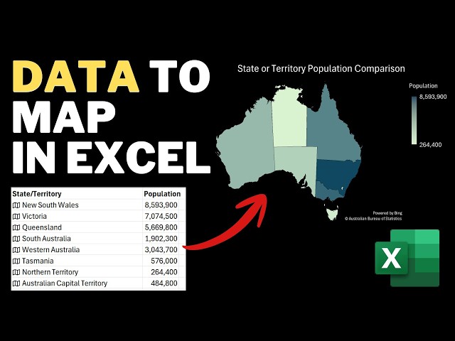
This beginner tutorial shows you how to use Excel's data types to make a clear data visualization, perfect for presenting ...

8:29
Excel Map Tutorial for Beginners - Easy & Fast to Make

109 views

7 days ago

Funded Frog
Microsoft Excel Full Review 2026 – The Most Powerful Productivity Tool!

Hey friends and welcome back to a new honest review! This video covers Microsoft Excel, exploring its features, formulas, ...

2:00
Microsoft Excel Full Review 2026 – The Most Powerful Productivity Tool!

0 views

1 day ago

Datacense
Make a Stunning Timeline Chart in Excel in Minutes

Create a Professional Timeline Chart in Excel (Step-by-Step) How to Build a Project Timeline in Excel (Easy Trick) Make a ...

19:45
Make a Stunning Timeline Chart in Excel in Minutes

661 views

3 days ago

Teaching Junction
How to Add Data Series to a Chart in Excel (Line Graph or Line Chart)

In this video, you will learn How to Add Data Series to a Chart in Excel (Line Graph or Line Chart). You can add one, two or ...

4:17
How to Add Data Series to a Chart in Excel (Line Graph or Line Chart)

257 views

7 days ago

KnowHow
How to Add Axis Titles in Excel Charts | Make Charts Clear & Professional

In this video, you will learn how to add axis titles in Excel charts to make your data easier to understand and more professional.

2:27
How to Add Axis Titles in Excel Charts | Make Charts Clear & Professional

14 views

6 days ago

Excel Tricks Tips
How to Create  Dynamic Excel Chart (Step-by-Step) || #excel  #excelchartstutorial

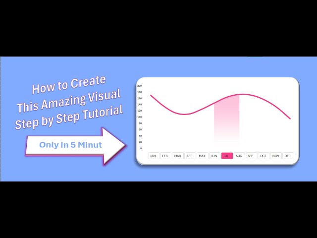
In this video, you'll learn how to create an amazing interactive Excel chart step by step in just 5 minutes. This dynamic chart allows ...

5:22
How to Create Dynamic Excel Chart (Step-by-Step) || #excel #excelchartstutorial

9 views

4 days ago

The 2Vibe Clips
How to create Dashboard using Excel | Step by Step Instructions | For Beginner and Advanced Users

Learn how to create a professional dashboard using Microsoft Excel step by step. In this tutorial I will show you how to build a ...

25:56
How to create Dashboard using Excel | Step by Step Instructions | For Beginner and Advanced Users

8 views

6 days ago

SHEQXEL
🚀 Risk Assessment Dashboard – Built in Microsoft Excel

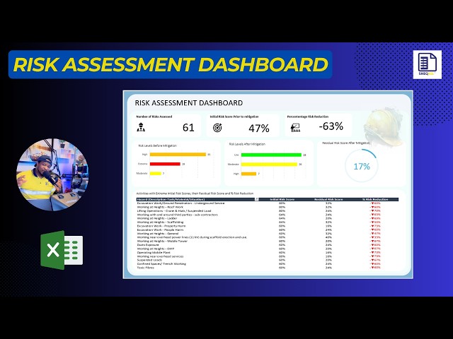
I've just completed a Risk Assessment Dashboard in Microsoft Excel designed to draw meaningful insights from a structured risk ...

8:49
🚀 Risk Assessment Dashboard – Built in Microsoft Excel

48 views

4 days ago

Efeoghene Oghenechovwen
Excel Sales Dashboard Tutorial 2026 - A Practical Guided Analytics Business Project #data #excel

Learn how to build a complete Excel Sales Dashboard from scratch in 2026. Perfect for beginners with no prior Excel experience.

5:15:51
Excel Sales Dashboard Tutorial 2026 - A Practical Guided Analytics Business Project #data #excel

95 views

3 days ago

Data with Ridwan
Excel Sales Data Analysis | Sales Dashboard Walkthrough (Data Analyst Project)

In this video, I present a complete Sales Data Analysis project using Microsoft Excel. This walkthrough shows how sales data can ...

0:54
Excel Sales Data Analysis | Sales Dashboard Walkthrough (Data Analyst Project)

47 views

6 days ago

Play with Data
Dynamic Excel Dashboard | Car Sales Analysis (2018–2025)

This video demonstrates a dynamic Excel dashboard built to analyze car sales data from 2018 to 2025. Key Features: • Dynamic ...

0:35
Dynamic Excel Dashboard | Car Sales Analysis (2018–2025)

103 views

7 days ago

Mentor Edge
Excel Intermediate Tutorials 1.4 Charts & Visualizations,#spreadsheetmagic#exceltutorial #exceltips

My Passion is to help students take control of their skills and expertise, building confidence in their abilities and services.

8:25
Excel Intermediate Tutorials 1.4 Charts & Visualizations,#spreadsheetmagic#exceltutorial #exceltips

5 views

3 days ago

Excel Visual
How to Create an Agile Project Management Dashboard in Excel for a Portfolio Showcase

Agile Project Management Dashboard in Excel with Futuristic Sprint Chart Template: ...

3:08:48
How to Create an Agile Project Management Dashboard in Excel for a Portfolio Showcase

265 views

4 days ago

Skill Spark
Learn Data Analytics from Scratch | Excel, Python & Data Visualization

Data is everywhere, but the real power comes from knowing how to analyze it and turn it into meaningful insights. Our Data ...

0:42
Learn Data Analytics from Scratch | Excel, Python & Data Visualization

0 views

2 days ago

Justinah Raphael-Ojo
EXCEL IN 2026: THE #1 SKILL EVERY DATA ANALYST MUST KNOW

In 2026, with powerful tools like Python, SQL, and AI analytics platforms, you might think Excel is outdated—but the truth is the ...

5:50
EXCEL IN 2026: THE #1 SKILL EVERY DATA ANALYST MUST KNOW

27 views

2 days ago

Fast Lessons With George
How To Make A Histogram In Microsoft Excel | Histogram Tutorial | [2026 Guide]

... Excel Productivity, Excel Tricks, Excel Sheet Setup, Excel Data Analysis, Excel Charts, Excel Graphs, Excel Visualization, Excel ...

2:50
How To Make A Histogram In Microsoft Excel | Histogram Tutorial | [2026 Guide]

4 views

4 days ago

Simon Sez IT
How to Add Sparklines in Excel - Use in Dashboards and Reports to Compare Data.

This video shows you how to add Sparklines in Excel to visualize trends directly inside cells without cluttering your worksheet.

6:13
How to Add Sparklines in Excel - Use in Dashboards and Reports to Compare Data.

767 views

2 days ago